Communifund is a mobile app crowdfunding platform that is inspired by the events of the ongoing COVID-19 pandemic.
A crossover of GoFundMe and Kickstarter, its aim is to help support local projects in communities with transparency and engagement with the need for community support being more important now than ever before.
Role – Product Designer
Timeline – June 2020 - September 2020
Tools – Figma, Useberry, Notion, Lucidchart, Typeform
Teammates –
Nadia Le, Product designer
Himesh Patel, Senior advisor & mentor
Problem Statements
Current crowdfunding apps are created with one sole purpose - to simply, donate to a project or cause.
That seems counterintuitive as to what community is and what it stands for, as it should actually be prolonging support throughout all stages of a project, and even after a project has ended.
With the COVID-19 pandemic, no one knows when things will be back to normal or what that normal will look like, times are constantly and rapidly evolving each day.
To add on, current crowdfunding apps provide only general outlines of a project that has been created; there is no streamlining method for donors to see the path of their money.
Such apps don't utilize the relationship between the beneficiary (creator) and benefactor (donor) in a transparent, incentivized, and overall better way. How might we integrate an effective process towards promoting a visible roadmap on community-focused projects?


Goal
To provide local project creators and donors with a digital platform to crowdfund community building projects.
This platform will strengthen community ties and provide an accessible resource for donors to view and track where their money goes.
Donors need to feel enticed and engaged to donate to community projects and causes. We plan to create a transparent crowdfunding platform that takes the donor on a journey to see where their money goes into creating and supporting projects.
Donors need to feel enticed and engaged to donate to community projects and causes. We plan to create a transparent crowdfunding platform that takes the donor on a journey to see where their money goes into creating and supporting projects.
User Research
Competitive Analysis
Survey
Interviews
User Personas
Journey Maps
Information Architecture
With crowdfunding apps such as GoFundMe and Kickstarter, not much information is given about the creator of a project. The most-used crowdfunding app in particular, GoFundMe, doesn't have a "Profile" section where you can learn more information about the creator, and why they joined the fundraising platform in the first place.
This raises some of the following concerns:
This raises some of the following concerns:
• Why should I donate or help support a creator's project?
• Is the creator legitimate, or are they actually a scammer behind a screen?
• How will I know that my donations will be used wisely and accordingly?
Extensive user research was conducted for Communifund, as the topic of crowdfunding happens to be a very niche one. We started off by doing:
1) Competitive Analysis
To start off, we analyzed 3 popular crowdfunding apps - GoFundMe, Kickstarter, and Patreon.
The most popular online crowdfunding platform. Individuals, groups, and organizations can all use this app for fundraising purposes. While it allows for easy and flexible customizations towards user-created campaigns, in addition to having no fees and 24/7 customer service, only 1 out of 10 campaigns ever get funded on GoFundMe.
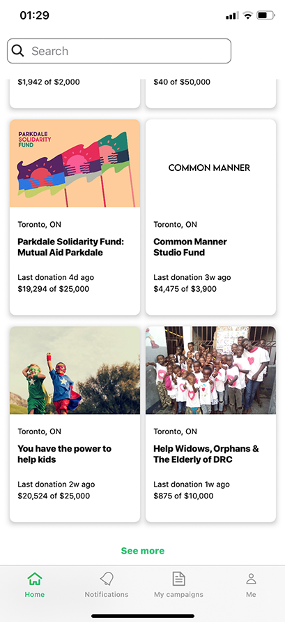

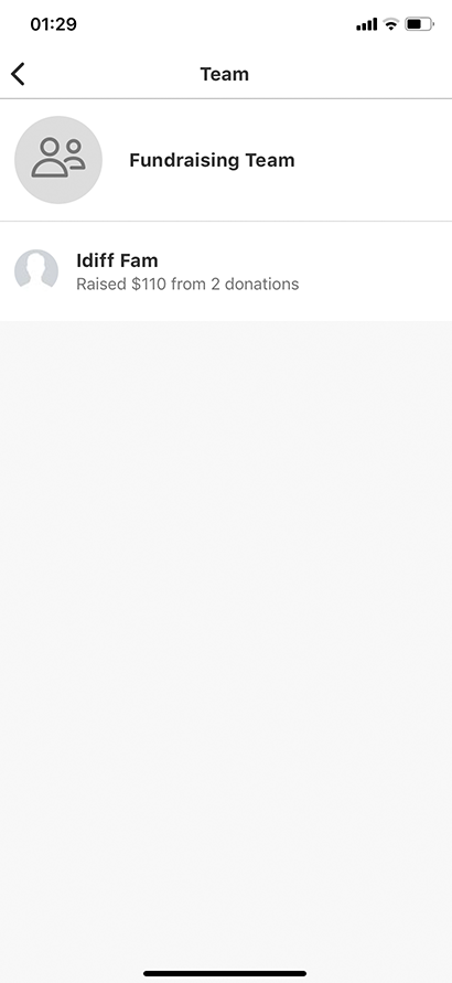
User flow of a featured project on the GoFundMe homepage. The selected project, "Help Widows, Orphans & The Elderly of DRC", was created on May 9, 2020, and as of September 17, 2020, it has only raised $875 out of its $10,000 goal. Its last donation was made 1 week ago. Upon viewing the Fundraising Team, it only displays its team members, and their profiles are inaccessible if a user was trying to click on their name.
Just like GoFundMe, Kickstarter users create projects that can be fundraised. Their focus is more centered around creative efforts and their business model of arts patronage - hence when donors back Kickstarter projects, they are offered tangible rewards (eg. material items such as the product itself) in exchange for their donations.
Funding on Kickstart is all-or-nothing. That means if your project doesn't meet its expected goal by the given timeline, you won't receive any of the funds that were donated to your project. This has been the subject of controversy, as seen in the example below of a 2015 Techcrunch article.
Funding on Kickstart is all-or-nothing. That means if your project doesn't meet its expected goal by the given timeline, you won't receive any of the funds that were donated to your project. This has been the subject of controversy, as seen in the example below of a 2015 Techcrunch article.
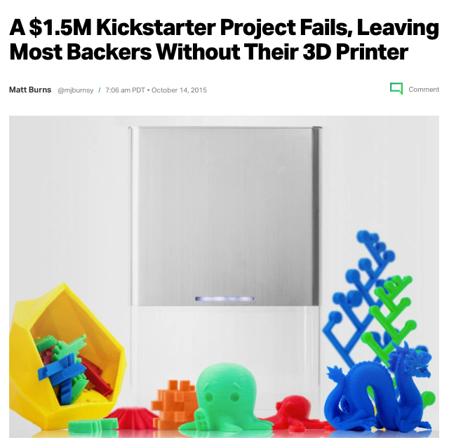
As a result of what was supposed to be a very promising, but failed $1.5 million Kickstarter project, many of its backers were left without a refund.
Acts as a subscription-based model. Users regularly contribute a set amount of money every month or per creation; this allows creators to build a relationship with their fans, making it easier to deliver exclusive content to their subscribers as an incentive to continue funding them. However, Patreon's marketing efforts towards its own userbase are weak in which entire verticals on their homepage are only dedicated to projects (and not the creators themselves) that you must follow and subscribe to in order to gain access to view.
2) Survey
3) Interviews
4) User Personas and Journey Maps
We garnered 43 responses from a survey that was sent out from Typeform. Our findings showed:
• 58% of respondents discover projects & initiatives they want to support, by social media.
• For those who have used crowdfunding apps before, a common answer we got was that the apps they used were "easy-to-use, simple to navigate, and trustworthy."
• For those who have never used crowdfunding apps before though, 40% of respondents were actually the opposite - they don't trust giving money to a source they're not familiar with, or don't use often.
• When asked, "How do you stay up to date on what's going on within your local community?", common answers include social media (eg. Facebook), word-of-mouth, and the news.
We interviewed 3 participants to get a better, in-depth understanding of the problems they faced in crowdfunding platforms.
The overall sentiment from those interviews was that trust is the most important factor when crowdfunding. In order to build trust in creating and maintaining a project, detail is important. "Sell" the cause; seeing is believing.
With the user research we derived from the survey and interviews, we compiled our data into user personas and their given journey map. With the journey map, they help to paint a better picture of how we want the eventual user experience of Communifund to look like.
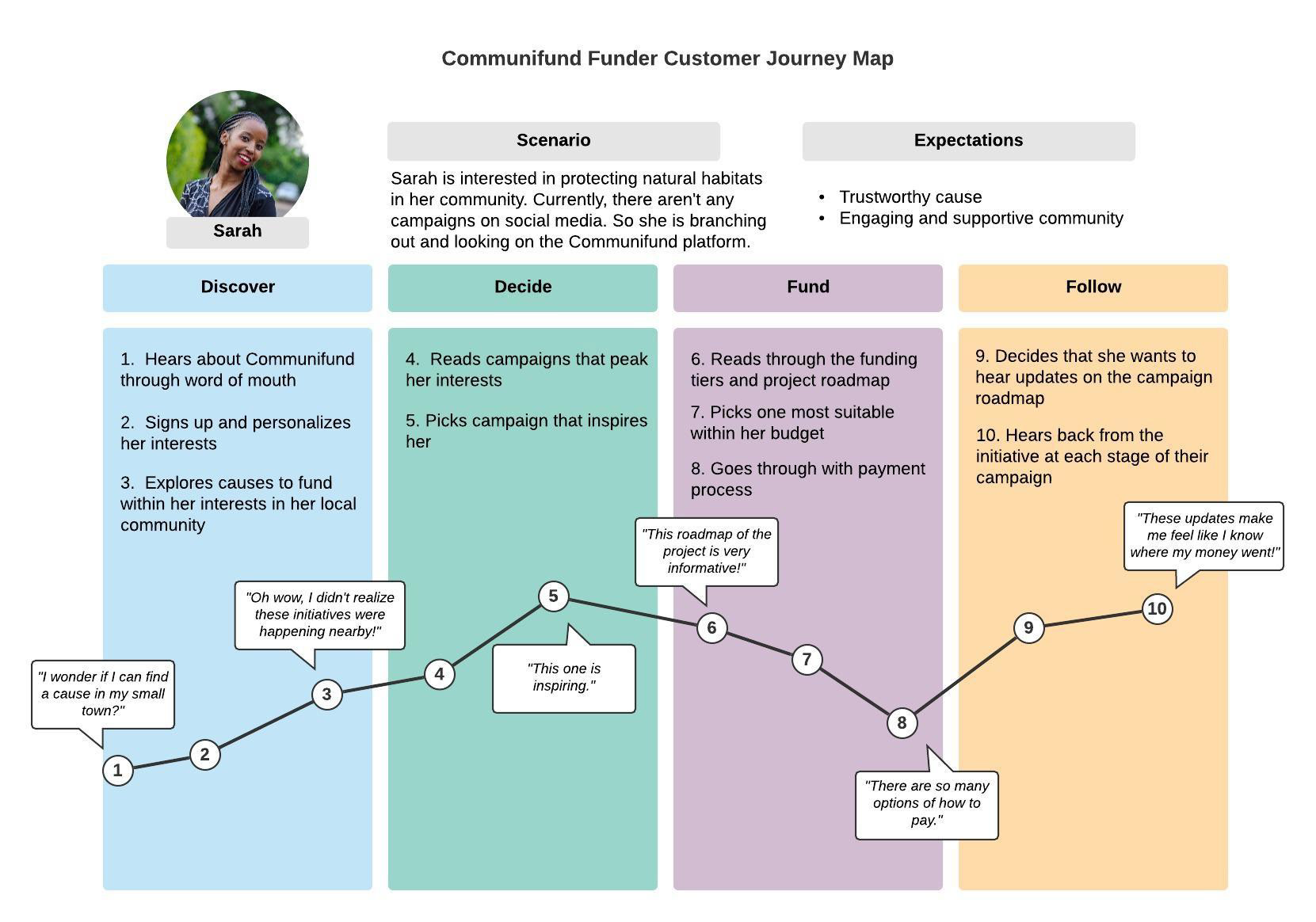
Sarah, the funder (project donor)
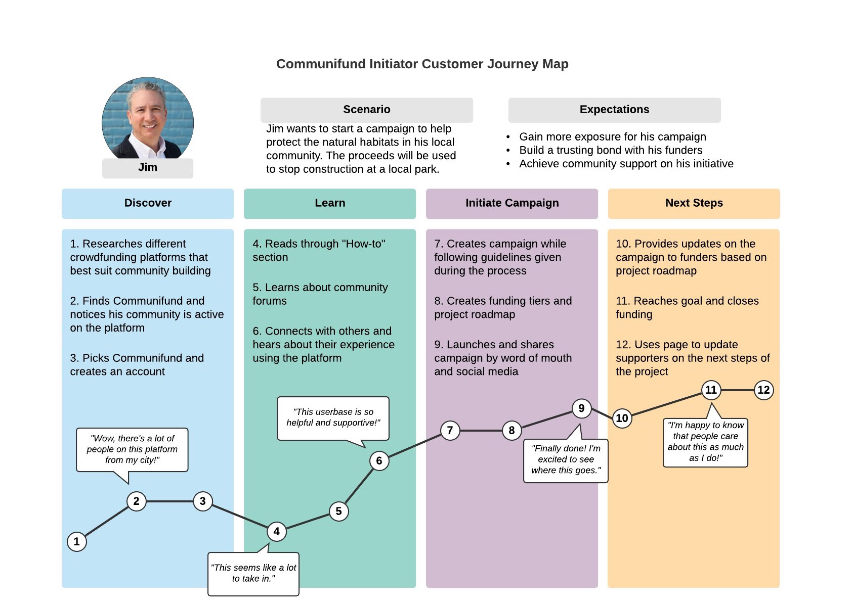
Jim, the initiator (project creator)
5) Information Architecture
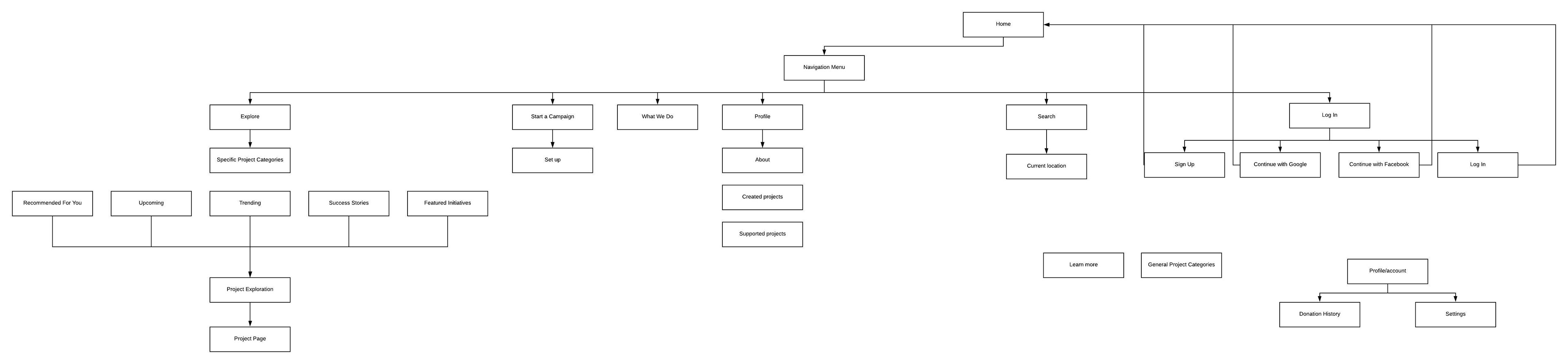
In the last step of our user research, an information architecture (IA) chart was created to map out the ideal user experience flow of Communifund.
From our IA chart, our benchmark findings included:
• A transparent funding process where donors are taken on throughout the journey, from start to finish.
• Engaged and active project creators, donors, and community members.
• Creators of their project or campaign are more accountable for the money they receive.
• A platform that instills trust in its user base.
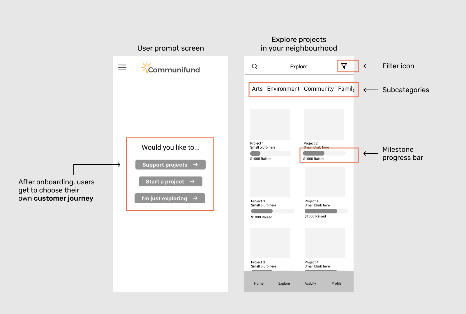
Wireframing
We approached the wireframing stage in an agile way, making many iterations as we went on getting feedback weekly from our mentor, Himesh. We wanted to truly understand what elements and features were most important before we went ahead in creating medium-fidelity designs to test on users.
This helped to better envision what the Communifund app would look like, especially once we would reach the high-fidelity mockup stage.
Usability Testing
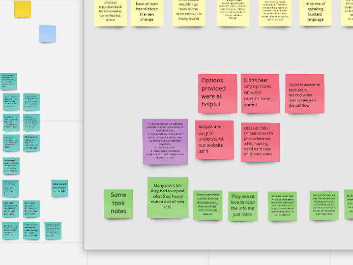
After finalizing the details of our low-fidelity wireframes, we prepared ourselves for the next stage of our project - usability testing. We spent a week and a half with 6 participants to test our app as if they were interacting with what would be the "real" version of Communifund.
Our findings showed that:
• In our medium-fidelity mockups, we added a huge "+" button on the bottom right that would open up project options. We were told that the plus button is actually an Android feature - we were designing for both Apple and Android, and weren't aware of this mistake.
• UX writing and language is very important. As both of us were working on Communifund for a few months at this point, we were obviously very familiar with the ins and outs of what we were doing, but not to our users who were testing our app.
• A step was missing in the Inbox feature. In our wireframes, when you wanted to message someone, it actually brought you straight to our default user named Samantha Reed. In a real app, you would need to choose the user you want to message; apps can't read your mind and assume automatically who you want to message.
• Icons are a language of their own. In our wireframes, if you wanted to compose a new message, the icon we used was a tiny "+" sign as well. To our participants who weren't tech-savvy, they were questioning what the plus sign was, and what it did. We had to change that.
• And of course, the importance of attention to detail! We forgot to link some of our icons, making them un-clickable. They were really small so this was probably looked over.
• Most users were questioning the graph in the Projects screen, as a graph is something you would normally see in a financial app instead. This was a really key finding that we had to explore further. This resulted in another iteration of the graph.
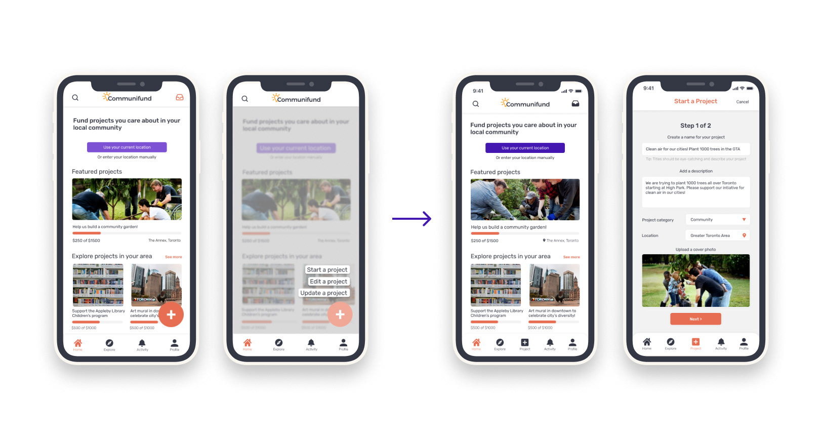
The "+" button on the left had to be removed for the final version. This is an Android feature. We wanted to design for Android and Apple so in our next iteration we added a new icon to the navigation bar.
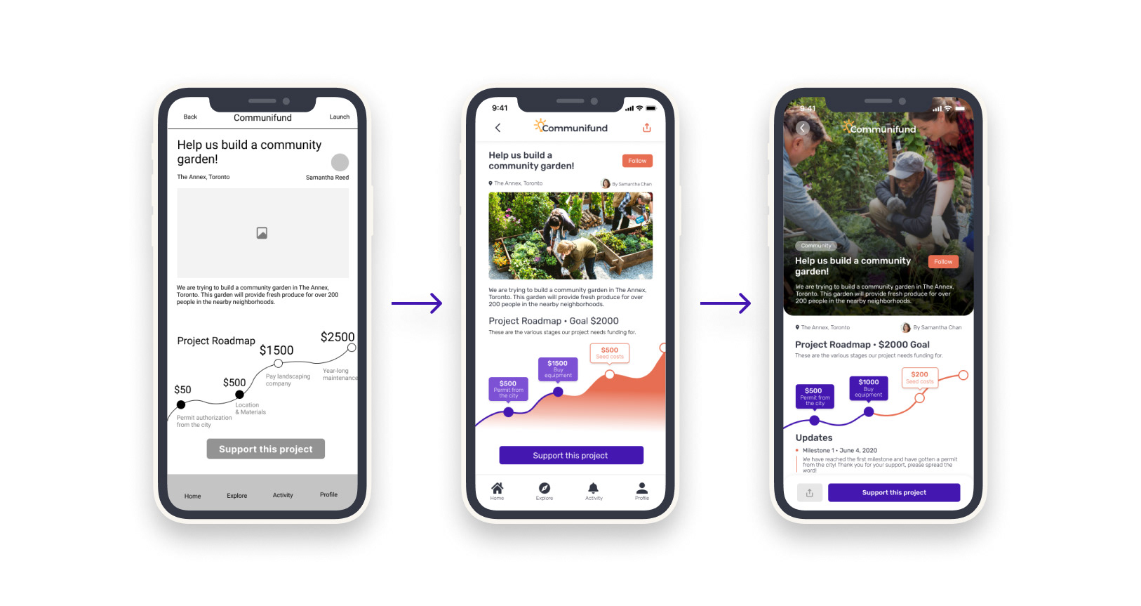
The middle screen is the one that was shown in user testing where the project roadmap caused confusion with most participants.
Conclusion
Takeaways
1) Self-awareness in designing for both iPhone and Android.
As we were designing Communifund for it to be used on any mobile device, be it iPhone or Android, the functionalities we incorporated had to be compatible for both devices. As mentioned during our user testing, we had a huge “+” button at the bottom right in our wireframe, and if you would click on it, it will give you the options to create, edit, and update your project. However, the + button is only specific to Android devices, as seen in Google Material Design guidelines.
After user testing, both of us were required to briefly read the iOS Human Interface and Google Material Design guidelines to understand best practices for designing mobile apps better, as well as determining which functionalities were specific to which platform only.
After user testing, both of us were required to briefly read the iOS Human Interface and Google Material Design guidelines to understand best practices for designing mobile apps better, as well as determining which functionalities were specific to which platform only.
2) Icons vs. words.
Maintaining consistency in all aspects and disciplines of design is key to producing a great app. There are some instances though, where you can't replace "Skip" with an icon, or replace the "Inbox" button with a word. Use your best judgment when adding in these components.
3) Working in the infamous slope.
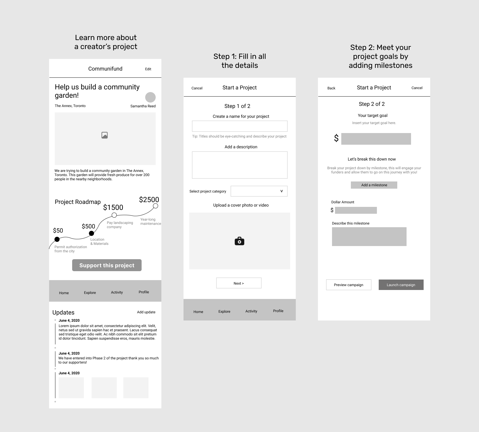
Perhaps one of our most discussed features, the purpose of the Projects slope in Communifund is to illustrate a project’s progress through the milestones the creator adds in.
It’s a cool feature. But it’s also stark, unconventional, and even challenging when we added it in. You usually see slopes or graphs in financial apps. How could we make sure that our users would be fully able to understand the slope when using our app?
Labelling is detrimental, and it took us a while before it finally dawned on us that the best user experiences are not only visual but are also explanatory through words. Interactivity is key too - this is seen when you tap on a point on the slope. The milestone labels pop up during the interactivity portion of the slope.
4) Even though we designed low-fi wireframes, our end result may not be reflective from the very beginning.
Constant iterations were being done, even after user testing and towards the end of the final prototype. Design is a rapidly evolving field that must be kept up with; it is very easy to fall behind quickly
For both Nadia and myself, this was our first time really digging deep into a product design project. We learned so much all throughout Summer 2020 by incorporating many UX research methods, really getting our design thinking juices flowing. With Nadia being in Vancouver and I in Toronto, we were in regular communication with each other through constant Google Meet meetings and Slack messages.
To add on, because we were a 2-person team (Himesh played a mentor role for Communifund), we really took on the role of multiple positions that you would normally find a large design team taking on. We improved our skills in UX research, UX writing, wireframing & prototyping, visual design, component libraries, and even project management.
If we had to do Communifund all over again, the both of us were pondering more towards the project owner or business side of things. For instance, adding more contextual features would have been a huge help, such as integrating Google Maps when you turned on your location, or Paypal integration when donating to a project. This would have improved our UX and would have made Communifund more of a realistic app to use, downloadable from the App Store.
Special shout-out goes to Nadia for all her hard work and to Himesh for his advice and guidance throughout the whole project. We all had a great experience :)